Accessible with bit.ly/frozen-soft and thanks for visiting | Please don't skip onto the direct link, whereupon use the ADF.LY/J.GS links, that really helps and means a lot to me | If you're using Chrome Browser, you can type frozen-soft.blogspot.com then press SPACE to search


Thursday, June 11, 2015

Tips on how to make your Windows 8/8.1 goes fast as Windows 7

As you know that Windows 8 and 8.1 got a loathe of bad critics from many users that comes from Windows 7. There are lots of changes there, and the one that is really obvious is the start screen. In the earlier Windows, we can easily access programs and run a command easily from a smaller but faster start menu. But since then, Microsoft suddenly decided that Start Screen will be loved by many users, because they loved it (What kind of business strategy is this?). Hey Microsoft, you're not the only users there. Of course, not all users will love this significant change.

There are of course, a lot of another new stuffs in Windows 8/8.1 that you won't see on Windows 7. But all these changes just suddenly make a wonky performance.

And here, I'll now help you as Windows 8/8.1 users, to improve it further. There are includes disabling unnecessary eye candy effects such as shadows, animations, etc. Also you'll be able to disable unwanted programs and services which start automatically with Windows.
 

So, check out these nice tweaks:
REGISTRY TWEAKS  
Make sure you know what you're doing, backup your registry first before doing this. 
1. Copy this code to notepad and save it as [FILENAME].reg
2. Run [FILENAME].reg and confirm.
 
SHADOWS & ANIMATIONS
1. Press WIN+S and type sysdm.cpl, press Enter
       Choose Yes on UAC Prompt if any
2. Go to Advanced, and click Settings under Performance
3. Select Adjust for best performance if you don't want any animations. But you can choose Custom and select that suits to you.

DISABLING AUTOSTART SERVICES
1. Press WIN+S and type in services, select View local services.

2. Open these each items and select Startup Type to Disabled
  • Diagnostic Policy Service
  • Distributed Link Tracking Client
  • IP Helper
  • Program Compatibility Assistant Service
  • Portable Device Enumerator Service
  • Remote Registry
  • Secondary Logon
  • Security Center
  • TCP/IP NetBIOS Helper
  • Windows Error Reporting Service
  • Windows Image Acquisition (WIA)
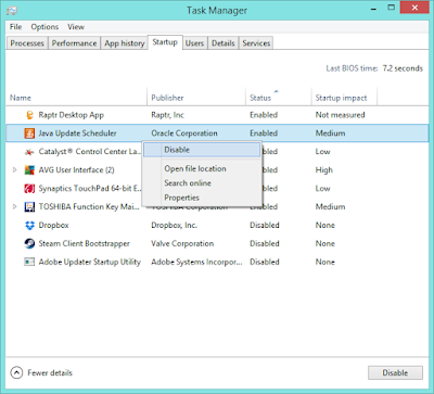
DISABLE STARTUP PROGRAMS
1. In Windows 8/8.1, startup options has been moved to the Task Manager, so open it by right-clicking taskbar and select Task Manager, or you can do it so by pressing and holding Ctrl+Shift+Esc 

2. Now at your Task Manager, select the program that you may rarely use, and click Disable button, or you can do it so by right-clicking the program and select Disable
Note that you can re-enable the disabled program again vice versa

REBUILD INDEX SETTINGS
From time to time, your Windows 8/8.1 search charm will feels sluggish and slower than before as if you use it very often. And I just found this problem on which Windows 8/8.1 have a different indexing system compared to the previous Windows. Rebuilding the index can temporarily solves the problem.

1. Now press WIN+S 
(If your search charm feels very very slow, you may want to press WIN+C > Settings > Control Panel. In the Control Panel Window, type in index in the search box and click Indexing Options)
2. "Indexing Options" Window will appear, and now click Advanced
3. In the Troubleshooting section, press Rebuild and click OK

Don't worry this is just to rebuild the index settings, it may take some time, but you can close the window while the process is still running. Click OK then click Close
 
UPDATE ONLY WHAT YOU NEED
Windows Update will tell you that Automatic Update is really important, but the fact is, is not 100% important at all. After your Windows had finished the installation, suddenly your Windows feels sluggish and a bit slowing down. And that is what happens to me.
In many case, it is better to choose the third option from the picture above "Check for updates but let me choose whether to download and install them". And the next step, you need to install the latest version of Secunia PSI, and it is fully free (Check out this beautiful software).
With this, you can check everything about the updates, but only the thing that is critical for your Windows.
And what you see from above, is Secunia PSI 2.0, but what is the main difference with the version 3.0?
From the looks, it is absolutely different, such as dashboard & scan results, but 2.0 is really a good tool for those who wants to keep in track with the details of the updates available for your computer.
In 3.0, indeed you can see the available updates, just like in 2.0, but you can't do it manually. Well, it all depends on your choice though.
Secunia PSI 2.0                           Secunia PSI 3.0
PSI 2.0     PSI 3.0

ADDITIONAL TIPS
  • Install only necessary software, don't force it to take too many software installed. (And surely to install the original version, patch or crack is mostly the answer on why your Windows is slowing down)
  • Use a good antivirus and keep it updated (Remember, original version)
  • (Check out this post)
  • Use a virtual machine to test any kind of suspicious software.
  • You can install Operating Systems as many as you want, but it is recommended to install no more than 3 OSes. Be sure that if you really use all of them, everytime.

Posted By Unknown 6/11/2015

Sunday, February 1, 2015

Windows 10 Technical Preview 2nd - Review


The version of Windows that Microsoft showed off this week has lots more features than the previews Windows Insiders have seen so far. Some of them will arrive in the next Insider build, some will come in February and others will show up over the next three, four or five months. We had a chance to see many of the new features in action – some on both phones and PCs – and to try a lot of them ourselves.

MAKING SENSE OF TOUCH
Some of the interface changes are small, but they make Windows 10 feel much more polished. They include a nicer taskbar, the Start menu having a simple control to flip from a small menu to a full-screen one, and neater, smaller borders around windows so they sit more comfortably next to each other
The notification bar replaces the Charm bar, and the default controls aren't that useful
The Charms bar has changed into a Windows Phone-style notification bar with an expandable set of handy settings – you can select what they are, although from a limited list – and you can get rid of individual notifications or whole sets of them, and pick which apps can put them there in the first place. Some of those notifications will let you click in and make an edit – like replying to a message right in the bar – which makes them much more useful than just having a list of what you've missed
You can choose which apps are allowed to show notifications
The new Settings app is sparse but will add many more controls
You do that from the new Settings app – in this build the full Control Panel is still there but over time everything will migrate into Settings, hopefully in a more logical arrangement than the jumbled mess Control Panel grew into
The Control Panel still lurks in this build
This build also has the first version of the interface changes Microsoft calls Continuum. This is called tablet mode and you can trigger it from the Notification bar, or by removing a removable keyboard. It switches all your windows to full screen, which is a very simplistic way of handling a tablet interface, but it combines with the other interface features to be more useful for touch users
Alt-Tab or swiping over the left side of the screen shows what apps you're running
You can now drag down a Windows desktop app to close it, just like a Windows Store app. When you swipe over the left edge of the screen you get the Alt-Tab view – and that includes both modern and Windows apps so you can pull them into place on-screen
Windows sit much more neatly side by side, sharing a single gutter rather than having two borders
If you want to arrange more than two apps your only option is currently the four-quarter Aero snap view which is still too fiddly to lay out with your fingers – but the Windows team is considering bringing back the Teeter feature that lets you drag windows around and have them snap into place in multiple vertical strips, as in Windows 8.1. This is still a work in progress, but it's more polished for both mouse and touch users in this build

CORTANA
As expected, Microsoft's voice-driven Cortana assistant comes to Windows 10, and she's very well integrated into the interface. There's always a Cortana bar in the taskbar and you can type a search in there, or tap the Cortana circle to see a welcome pane with your news, interests, weather and other Cortana info. You can tap the microphone icon to talk to Cortana – and we tried the "Hey Cortana" voice activation on a couple of different PCs and it worked well, even using a standard laptop microphone with lots of background noise

Search with Cortana and you get apps you already have, suggestions for more apps and web searches
When you search with Cortana, you get apps on your PC, apps you could install, settings on your PC and web results. That's the same set of results you see when you hit Windows-S and search, because Cortana takes over that keyboard shortcut. And when you hit the Windows key and type to search, you're doing the same Cortana search – just inside the Start menu interface, because you hit the key people associate with the Start menu

If you want to search for files you can type or say things like "show me my files about charity" or "show me my photos from last month" or "show me my slides from this year". That opens a new window with a list of files, not an Explorer window, and that window closes if you do anything else, which is irritating – but it's a very friendly interface to search that will learn new terms the same way Cortana does

Cortana suggests information as you type in the Spartan browser address bar
Being able to set a reminder by talking to your computer – or typing – is handy, but it's everything that Cortana knows about you that's going to be really important. The Project Spartan browser isn't in the build we were able to try out, but Cortana is built in: if you type in Delta because you want to go to the Delta website, and Cortana knows that you're tracking a Delta flight, the flight details pop up next to the address bar in the browser – just in case you wanted to check that flight. Cortana has huge potential in Windows and even these first features should be really useful

The Cortana integration in the new browser will mean you'll see the same search history whether you look in your browser, Cortana or the Start menu. That's just one of many more places where the multiple different tools we're used to in Windows are starting to turn into a more unified system

Project Spartan isn't in the mix yet – the browser here is still IE
HAPPIER APPS
The Office universal apps aren't in the Windows 10 build we tried either, but we have seen them in action on Windows 10 phones. Windows 10 is what you'll get on your phone as well as your PC or tablet, although the interface is designed for the small screen, and universal apps like Word, Outlook – for both mail and calendar – PowerPoint and Excel will be included on all Windows 10 devices

The phone versions of these tuck the ribbon away in a formatting pane you have to open at the bottom of the screen, but they have a full range of features, from being able to track and review changes in Word, or use built-in commands like typing =lorem() to generate automatic text, to full animations and transitions in PowerPoint

Universal Outlook takes the clean look of the Windows 8.1 Mail client and adds in the best features of both the Windows Phone calendar and the management gestures of Accompli on the iPhone (recently bought by Microsoft) plus some new options

The agenda view in the Calendar is back in the universal Outlook app
The endless scrolling agenda is back so you can see a list of all your upcoming meetings, but you can also pinch and zoom to switch to month view or choose how many days you see on screen at once, and even how much space each day takes up on-screen. You can colour-code meetings, and that function uses the same categories you'd use in full Outlook today, so if you're already using categories you don't have to change what you do (although they won't sync for email until later on)
The classic email view in the new touch Outlook
On a PC you can look at messages in the familiar three-pane view; on a phone or tablet you'll use the one-pane inbox view more. The gestures for deleting and flagging mail from the inbox list work well – you can customise it (if you're left-handed, say), but the default is you swipe left to delete a message and right to flag it. It's less error-prone than Accompli, where you can delete a message without meaning to, and there will be other options like archiving messages using the same left/right distinction of messages you don't want, and messages you need to deal with
Because it's Outlook, the mail editor is powered by Word – so you can create tables in it, even on your phone
Again, the new universal Videos, Music and People apps weren't in the build we used, but they'll get makeovers similar to the Maps, Photos and Messaging apps we saw
Photos looks more like the Windows Phone photo app rather than the Windows 8 or 8.1 app, and it's more useful than either. It has features that users of Windows Live Photo Gallery will remember (it's built by that team) but updated to deal with Windows services like OneDrive and the oddities of Lumia phones. It doesn't let you tag photos, although Microsoft encouragingly told us "we know that's important". Currently it groups photos by day – the automatically curated albums will come later, as will naming the groups of photos you see by their location if they've been geotagged by your phone

The Photos app automatically groups and enhances your photos
But the two really useful features Microsoft is promising for Photos are already there, namely automatically enhancing photos (like fixing brightness, contrast and red eye) and not showing the same photo multiple times. If you used burst mode, or Windows Phone 8 uploaded the low resolution version of your photos to OneDrive and you copied the high resolution version to your PC, or you have a RAW and JPG version of the same file, you'll only see one of them
And that's handled very sensibly – you'll see the JPG until you want to edit and then you'll get the RAW, for example. We haven't tried that out with large and complex photo collections where images have been renamed, but so far it seems to really simplify managing your images

The Windows Phone Maps app gets much better and also comes to Windows desktop
The Maps app takes the five different phone navigation apps Microsoft put on Windows Phone and brings them together in one app where you can search for places, and receive navigation that automatically picks walking or driving depending on how close your destination is, can give you public transport routes, takes traffic into account and will reroute you if the traffic changes. And it has a clean simple interface that's ideal for phones and small tablets, where it's going to get used most, plus there's voice control – Cortana will read you directions and if you don't hear one you can say "say that again" to have it repeated
The Messaging app also has a very Windows Phone feel, bringing back the integration of text messaging with online messages – this time Skype. When a Skype notification appears at the top of your phone screen you can tap and answer it straight away without having to unlock the phone and open it. And you'll be able to jump from a text conversation to a phone call – that will include making a Skype call without having to go and open the Skype app, but the interface for that isn't in this version yet

This is the Start screen you see when you tap the control to show it full-screen
EARLY VERDICT
There are still areas of concern (especially OneDrive, which hasn't regained key features from Windows 8.1) and we didn't get a chance to try exciting features like Project Spartan, but the progress in this release is excellent.

If you love Windows 8.1 and touch, you'll have a lot of adjustments to make and we hope the continuing debates inside the Windows team bring back more of those interface features, but for most people Continuum is a good balance between updating the desktop look and making touch useful.

Key charm bar features are back on the Notification bar and desktop apps that want to will be able to use the Share charm, just like modern apps. Putting Cortana on the desktop is expected but still a stroke of brilliance, especially the way it's integrated into both Start and Search. Microsoft needs to keep up the quality, fill in more details about security and polish the final pieces, but at this stage Windows 10 looks like a version people will be happy to upgrade to.


GOOD AND BAD
+
  • Continuum and interface improvements
  • The Notifications bar has the best parts of the Charm bar
  • Cortana makes sense of both search and voice control
  • Universal apps are much higher quality – on desktop and phone
-
  • Die-hard Windows 8.1 users will miss some features
  • Four-way Aero snap is still awkward and fiddly
  • It's unclear what upgrades will cost after the first year
  • No changes to OneDrive 

NOTE: This review is not made by me
SOURCE: TechRadar

Posted By Unknown 2/01/2015

Friday, January 30, 2015

MiniTool Partition Wizard Server Edition 9.0 FINAL (+Serial)


MiniTool Partition Wizard Server Edition is one of the best server partition manager software. It not only covers all the functions of the pro edition, but also supports more operating environments, like: Windows Server OS and workstation.

KEY FEATURES
ALL-IN-ONE DISK MANAGER
Manage both basic disk and dynamic disk with one solution, no matter you want to resize partition or dynamic volume, MiniTool partition wizard server could solve the problem

ENHANCED DATA PROTECTING
Advanced security measure designed to the operation of Move/Resize. When you carry out the function of Move/Resize, your data and source files will be under protection. Despite of the power failure or hard ware failure, your data are all safe

NO REBOOT REQUIRED
One-key extend partition wizard helps increase system partition size without rebooting to minimize server downtime


SCREENSHOTS


SUPPORT
OPERATING SYSTEMS
  • Windows® Server 2000 (all editions)
  • Windows® Server 2003 (all editions)
  • Windows® Server 2008 (all editions)
  • Windows® Server 2012 R2 (all editions)
  • Windows® 8 (all editions)
  • Windows® 7 (all editions)
  • Windows Vista® (all editions)
  • Windows® XP (all editions)
DYNAMIC TYPE VOLUMES
  • Simple
  • Spanned
  • Mirrored
  • Striped
  • RAID5
FILE SYSTEMS
  • FAT16
  • FAT32
  • NTFS
  • Ext2
  • Ext3
REVIEWS
"MiniTool Partition Wizard Server Edition is a professional software application designed to help users create, delete, format, move, or resize partitions.
It sports a clean and straightforward layout that displays the current partitions found on the computer. Plus, the program reveals information about them, such as capacity, used and unused space, file system, type, and status (hidden, system)." (★★★★★) -SOFTPEDIA
"MiniTool Partition Wizard Server Edition is a special designed server partition manager. This partition manager server is designed for system administrators and advanced users to manage both server and non-server disk partition." (★★★★★) -SOFTONIC
DOWNLOAD
SERVER EDITION 9.0 FINAL + SERIAL
Block PartitionManager.exe on your firewall

[FROZENSOFT-DL - 22.49 MB]
[MAGNET LINK - 22.49 MB]

Posted By Unknown 1/30/2015

Wednesday, January 14, 2015

Colorful Windows 8 Wallpaper Theme Pack

Want a windows 8 sleek and minimalist wallpaper style but didn't know where to find at, well you are now in the right page.

I'd like to remind you, that these wallpaper packs are made from only one wallpaper from YouTube user (I'd forgot that) with the link provided and re-edited with photoshop

Nah, no need to wait longer. Wallpapers included:
 

[DROPBOX - 435 KB]
 http://adf.ly/wEotA


Or if you prefer Windows 7/8/8.1/10 Theme Pack file, here it is
WINDOWS 7
[DROPBOX - 231.77 KB]
http://adf.ly/wEpOB

WINDOWS 8/8.1/10
[DROPBOX - 231.77 KB] 
 http://adf.ly/wEpFN

Posted By Unknown 1/14/2015

 
Claim Free Satoshis Now!